BBC ident history
Since the launch of the channel in 1964, BBC ONE has seen nine different incarnations of the on-screen identity.
 | 1966 - While the BBC 1 ident symbol remained, a "watch-strap" globe was introduced in 1964, showing the globe in the middle of a striped band. In 1968, the channel converted to colour - the globe and BBC 1 logo remained. |
 | 1969 - The first colour ident was introduced. A blue and black mechanical globe rotated while a curved mirror placed behind made up the famous image. |
 | 1972 - The globe and colour scheme remained the same, but a rounder, italic font was used for the ident introduced in 1972. |
 | 1978 - A new blue and yellow globe was introduced. The colour was added using electronics and a new big bold font was introduced. |
 | 1981 - A colour change was made to the globe - yellow became green. The caption also changed to a double line version (similar to the BBC 2 logo of the time). |
 | 1985 - The new rotating gold and blue BBC 1 globe was introduced. Called COW, for Computer Originated World, it was the first time that BBC 1 had abandoned mechanical models and still slides and used a completely computer generated image. |
 | 1991 - The COW globe was replaced with a new on-screen image designed by Lambie-Nairn (who worked on the Nine O’Clock News ident). The design was a swirling world of shadows and reflections. |
 | 1997 - The new style BBC ONE ident and logo was dominated by the red and yellow globe balloon. The balloon was filmed flying over 10 different British locations.
|
Rythm and movement 2002-2006
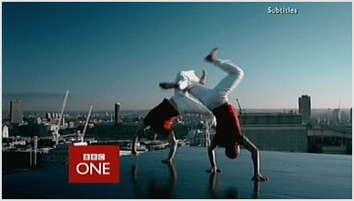 The new idents were collaboratively called the 'Rhythm and Movement' idents and featured dancers at various locations dancing to different musical styles. These proved to be hugely unpopular; some viewers accused the BBC of being overtly politically correct, as one of the idents involved disabled dancers in wheelchairs, while other viewers were dismayed that the longstanding globe motif had been abandoned after 39 years. This was also the first new presentation package not to include a clock though one had been designed — it had become difficult to transmit the time accurately, given the delay introduced by satellites and digital transmission.
 After four years, the idents were replaced themselves by a new set introduced on 7 October 2006, abandoning the overtly red colour scheme yet retaining the colour slightly less obviously as the main colour. The relaunch brought about a new channel logo once more with the box replaced in favour of a lowercase name, effectively appearing as "BBC one".
A circle motif now features as the main theme of the idents, while the content is much more diverse than previous: swimming hippos, motorcycle stunt riders, children playing "ring a roses", lit windows, surfers, football players, the moon, kites, and a red arc circling the logo
i got this information from
(BBC.co.uk) and (wikipedia)
No comments:
Post a Comment