ident analysis
A TV ident is a short visual image employed between television programmes that works as a logo to locate the viewer to the channel. Viewers remember certain channels just because of their idents. Idents are made to appeal to the channels target audience increasing the amount of viewers the channel gets.
BBC One scape:
 This TV ident starts off with a close up on a bike wheel and starts to slowly zoom out revealing a person riding the bike with a rain coat on with rain pouring on them. At the beginning the ident is very dark and gloomy, but then starts to lighten up as the rain stops and more people on bikes are introduced. As the ident becomes more bright and less gloomy the music in the background starts to lighten up and become more cheery and has a summery vibe to it. Typography is used in this ident which is the BBC One logo itself. The logo is revealed in the roundabout towards the end because it makes the viewers have to wait to see what channel this ident is representing. This ident uses many camera angles and camera views such as a birds eye view. This ident lasted for 36 seconds which is long for an ident, I think that longer idents start to tell a little bit of a story which engages the audience. This ident doesn't use any animation or CGI as it is all real footage. BBC One doesn't have a specific target audience, we can see this in the ident as it is very simple, but clever at the same time. The ident also used a lot of colours which also makes it more appealing to the younger generation. The screen tempo in this ident was slow, but sped up a little bit towards the end. The ident does interact with the viewers because they have to watch and see how the circle is going to be made. This ident is for entertainment, but also includes some information such as scheduling which is done via voice to let the viewers know which programme is on next.
e4 beach:
 This TV ident for e4 is made using stop motion animation. This ident is based on a beach theme and uses a lot of vibrant colours that stand out. The main colour used is a bright vibrant purple which is the colour that represents the brand. There is a lot going on in this ident that doesn't make sense and is very random. The ident starts as a rubber dinghy moving along the sand with animated animals inside, fishing from the boat. One of the animals then falls off into the sand and in the background while all this is happening a variety of different things that don’t have much relation to each other or to the advert are happening. There is a TV playing, a hamper basket and picnic laid out on the floor, a deck chair which then gets pulled away by some purple tentacles and then two hairdressing chairs. The e4 sign then comes up from the ground, created by flowers. There is no typography used in this logo except from when the logo is shown. This ident really represents the company well as is very appealing to the target audience which is the younger generation. This is appealing because of the bright colours used and the fact that it is random and doesn't make sense. there is a lot of animation used in this ident. The screen tempo in this ident is slow, but at the same time there is a lot happening which appears to make the ident look faster than is actually is because there is always something to look at. there is music playing throughout the ident which is a childish nursery rhyme kind of music. This ident is purely for entertainment and interacts with the viewers because there is so much to look at.
Nickelodeon logo:
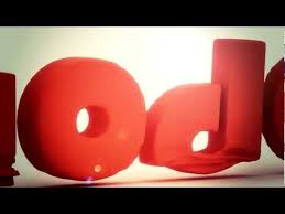 The ident is very simple as all that is involved is the Nickelodeon logo. They start by showing close ups of the letters all squashed down, pinging up almost in a play dough like way. The camera then zooms out to show the Nickelodeon logo in orange, against a plain white background. The only typography included is the logo and because of the channel being for children they have created there ident in quite a child like way by making it look as though the letters are made out of plasticine. The logo is also in orange, and Nickelodeon are known for always using orange as there own recognisable branding technique. It’s a very bright colour that stands out, especially against the white background. I think they could of made this ident a little more arresting by involving some more visuals and to make it a little longer, however it could still have its advantages of being simple as the channel is for children so they would want them to understand it. There isn’t any music or sound in the background which I think would definitely make it more intriguing to watch, it’s definitely one of the most simple and in incomplex indents I have seen. The ident is also only eight seconds long but it have been any longer, then I think they would have put more visuals and sound on screen so I think the timing is perfect for what they are showing on screen. I think the target audience for this ident is 7-12 male and female. This is because the programmes on this channel are aimed towards children, so it’s likely that they will be the ones watching it. They have branded there channel well because the whole ident is based around there logo.
BBC One scape:
e4 beach:
Nickelodeon logo:
No comments:
Post a Comment